Workshop: CA
As can be seen from the last workshop, PCA is used for any numerical features but we may want to perform dimensionality reduction with categorical features. We can use correspondence analysis (CA) for categorical data. Here, we will focus on bivariate CA with a two-way contingency table. As in PCA, the idea in CA is to reduce the dimensionality of a data matrix and visualise it in a subspace of low-dimensionality, commonly two- or three-dimensions. The data of interest in simple CA are usually a two-way contingency table
or any other table of nonnegative ratio-scale data for which relative values are of primary
interest.
This workshop will take you through the mathematics behind CA and how to use existing R packages for CA.
Toothpaste usage data
Recall the mathematical theory behind correspondence analysis (CA) with formulas given in the lecture slides provided for CA. We will now follow the step-by-step procedure using the data on toothpaste usage to produce analyses similar to the ones that was produced based on an existing R package for CA in the lecture note.
The first step is to read the data into R:
Region1 <- c(5, 5, 15, 15)
Region2 <- c(5, 25, 5, 5)
Region3 <- c(30, 5, 5, 0)

dat <- data.frame(Region1, Region2, Region3)
rownames(dat) <- c("BrandA", "BrandB", "BrandC", "BrandD") # row names are needed for row points
dat
## Region1 Region2 Region3
## BrandA 5 5 30
## BrandB 5 25 5
## BrandC 15 5 5
## BrandD 15 5 0Next, convert dataframe dat to a table with margins as follows:
cdat <- addmargins(as.table(as.matrix(dat)))
cdat
## Region1 Region2 Region3 Sum
## BrandA 5 5 30 40
## BrandB 5 25 5 35
## BrandC 15 5 5 25
## BrandD 15 5 0 20
## Sum 40 40 40 120The table cdat is the required contingency table.
The next step is to establish a test to check whether there is a significance association between rows and columns. This can be accomplished by running the chi-square test on the original data.
chisq <- chisq.test(dat)# Notice that this is based on "dat" and not "cdat"
chisq
##
## Pearson's Chi-squared test
##
## data: dat
## X-squared = 79.607, df = 6, p-value = 4.307e-15Why do you think this test is important? The answer is that we need to establish association between rows and columns before proceeding to CA. Here the p-value is less that the usual 5% level of significance. It seems that there exists a significant association between the row and the column categories.
When the contingency table is not very large (as in cdat), it’s easy to visually inspect and interpret row and column profiles. For example, Brand D is not used in Region 3 whereas Brand A is more often used in Region 3.
Now we follow the steps one-by-one to perform CA.
- First step is finding the correspondence matrix \(Z\):
Z <- cdat/sum(dat) # Z = P/n, note that n = sum(dat) is grand total
Z
## Region1 Region2 Region3 Sum
## BrandA 0.04166667 0.04166667 0.25000000 0.33333333
## BrandB 0.04166667 0.20833333 0.04166667 0.29166667
## BrandC 0.12500000 0.04166667 0.04166667 0.20833333
## BrandD 0.12500000 0.04166667 0.00000000 0.16666667
## Sum 0.33333333 0.33333333 0.33333333 1.00000000Now select the row mass \((r)\) (sum over the columns) and column mass \((c)\) (sum over the rows) from \(Z\) as
row.mass = Z[1:4, 4] # [1:4,4] means select the 4th column and the first 4 rows corresponding to it
row.mass
## BrandA BrandB BrandC BrandD
## 0.3333333 0.2916667 0.2083333 0.1666667col.mass = Z[5, 1:3] # [5,1:3] means select the 5th row and the first 3 colums corresponding to it
col.mass## Region1 Region2 Region3
## 0.3333333 0.3333333 0.3333333The maximum number of dimensions expected is \(k = \mbox{min}(I − 1,J − 1)\), which is \(k = 2\) in this case.
- Calculate the matrix of standardized residuals given as \(S= D_{r}^{-1/2}(Z-rc^{T})D_{c}^{-1/2}\), where \(D_{r}\) and \(D_{c}\) are the diagonal matrices obtained from row mass (\(r\)) and column mass (\(c\)). \(S\) can be seen as a standardised \(X\) in the context of PCA.
Dc = diag(col.mass) # turns "c", the column mass vector to a 3X3 diagonal matrix
Dc
Dr = diag(row.mass) # turns "r", the row mass vector to a 4X4 diagonal matrix
Dr
Notice how we have used the diag function in R to create the diagonal matrices. Type \(D_c\) and \(D_r\) in the console to see the output clearly.
The sqrtm() function in the package expm computes square root of positive definite square matrices:
library(expm)
pr = sqrtm(solve(Dr)) # We first took the inverse of D_r matrix and then the square root
pc = sqrtm(solve(Dc)) # We first took the inverse of D_c matrix and then the square root
zz = Z[1:4,1:3] # remove row/column masses to get 4 by 3 matrix. That is,
# select the first 4 rows and the corresponding first 3 columns
rowtcol = (row.mass%*%t(col.mass)) # this is r*c^{T} in the formula.
S = pr%*%(zz-rowtcol)%*%pc # Weighted distance or matrix of standardised residuals.
S## [,1] [,2] [,3]
## [1,] -0.2083333 -0.20833333 0.4166667
## [2,] -0.1781742 0.35634832 -0.1781742
## [3,] 0.2108185 -0.10540926 -0.1054093
## [4,] 0.2946278 -0.05892557 -0.2357023The dimension of S is \(4 \times 3\).
- The
svdfunction in R can be used to compute \(S = UD_{\alpha}V\), where \(U^{T}U = V^{T}V = I\) as follows.
svd_res = svd(S) # "u" from the created object is used to compute the row points
# while "v" is used for the column points.
The eigenvalues can be used to determine the inertia. Recall that this is the square of the singular values.
options(scipen=999) # to prevent scientific notation such as 1e+5 instead of 100000.
eig <- round(svd_res$d^2, digits=5) #"round" and "digits =5" is to round up to 5 decimal places.
eig
## [1] 0.41026 0.25313 0.00000What does the zero eigenvalue implies? Simply we can remove the redundant dimension.
eig <- round(svd_res$d^2, digits=5)[1:2]
variance <- eig*100/sum(eig) # Variances in percentage
cumvar <- cumsum(variance) # Cumulative variances
eig2 <- data.frame(eig = eig, variance = variance,
                 cumvariance = cumvar)
eig2
## eig variance cumvariance
## 1 0.41026 61.84296 61.84296
## 2 0.25313 38.15704 100.00000
We can write an R code to make a scree plot from these values (see the barplot function from Workshop: PCA).
#Making screeplot
barplot(eig2[, 2], names.arg=1:nrow(eig2),
        main = "Variances",
        xlab = "Dimensions",
        ylab = "Percentage of variances",
        col = "steelblue")
# Add connected line segments to the plot
lines(x = 1:nrow(eig2), eig2[, 2],
      type="b", pch=19, col = "red")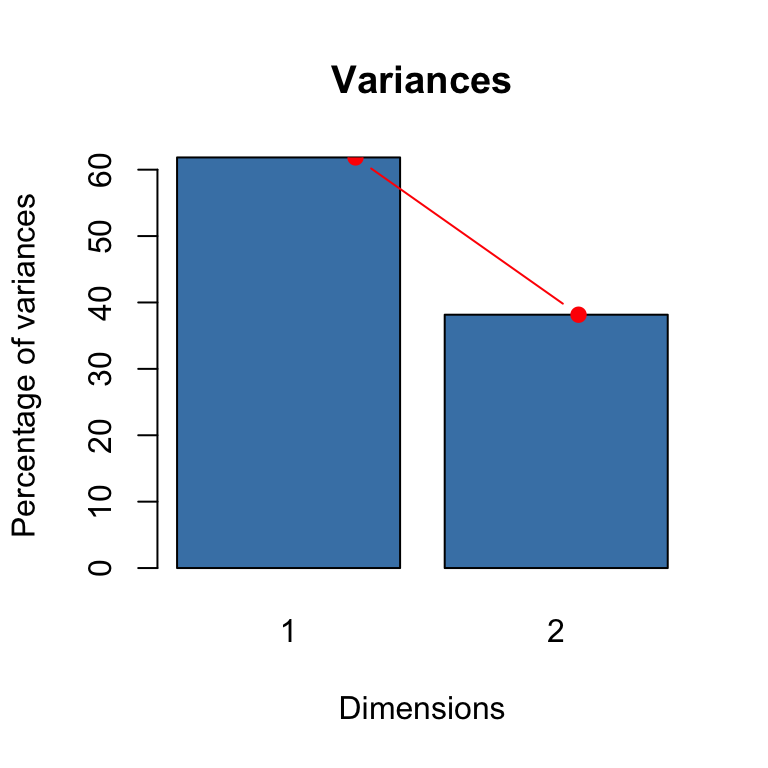
- The principal axes of rows can be obtained as \(F = D_{r}^{-1/2}U D_{\alpha}\)
F <- pr%*%(svd_res$u)%*%diag(svd_res$d)
row.coord <- F[1:4,1:2]
rownames(row.coord) <- rownames(dat)
colnames(row.coord) <- paste0("Dim", 1:2)
row.coord
## Dim1 Dim2
## BrandA -0.8776079 0.1051400
## BrandB 0.3179429 -0.7429492
## BrandC 0.3391090 0.4527749
## BrandD 0.7749294 0.5239126Check to see that the result for the row coordinates above agrees with the ones that we obtained in the lecture slides using the FactoMineR package.
We can use the code below to plot the corresponding row points (profiles):
xlim <- range(row.coord[,1])*1.2
ylim <- range(row.coord[,2])*1.2
plot(row.coord, pch=19, col = "blue", xlim = xlim, ylim = ylim, main = "Row profile")
text(row.coord+0.025, labels=rownames(row.coord), pos=3,col ="blue")
abline(v=0, h=0, lty = 2)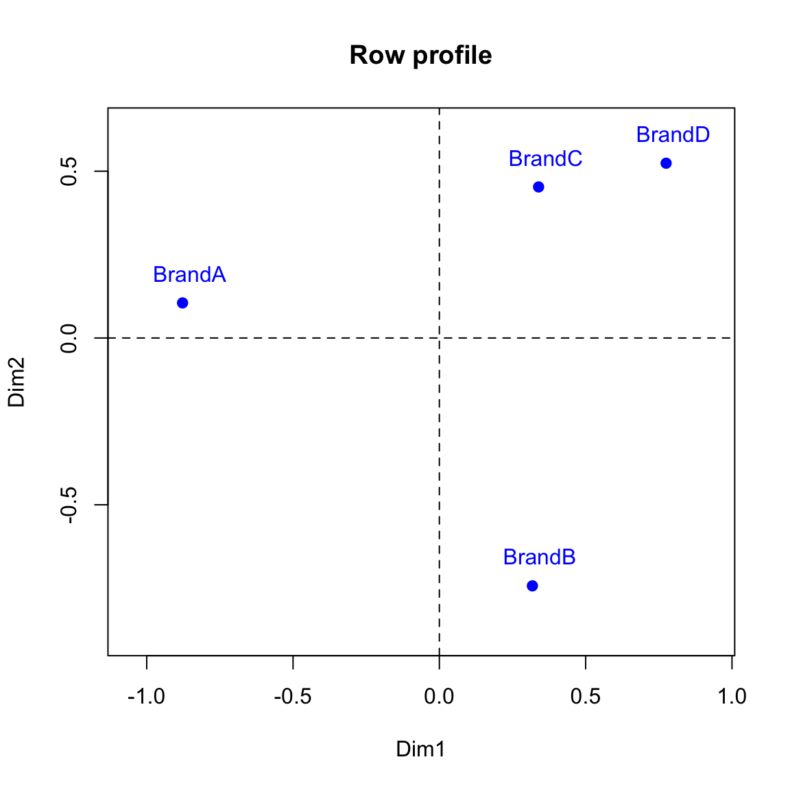
- We can modify the R code above to obtain the principal axes of columns using \(G =D_{c}^{-1/2}V D_{\alpha}\). We need to remove the redundant dimension before plotting the column points.
#principal component of columns
G <- pc%*%(svd_res$v)%*%diag(svd_res$d)
col.coord <- G[1:3,1:2]
rownames(col.coord) <- colnames(dat)
colnames(col.coord) <- paste0("Dim", 1:2)
col.coord
## Dim1 Dim2
## Region1 0.5430107 0.56950490
## Region2 0.3563824 -0.65414241
## Region3 -0.8993931 0.08463752xlim <- range(col.coord[,1])*1.2
ylim <- range(col.coord[,2])*1.2
plot(col.coord, pch=17, col = "red", xlim = xlim, ylim = ylim, main="Column profile")
text(col.coord, labels =rownames(col.coord), pos=3, col ="red")
abline(v=0, h=0, lty = 2)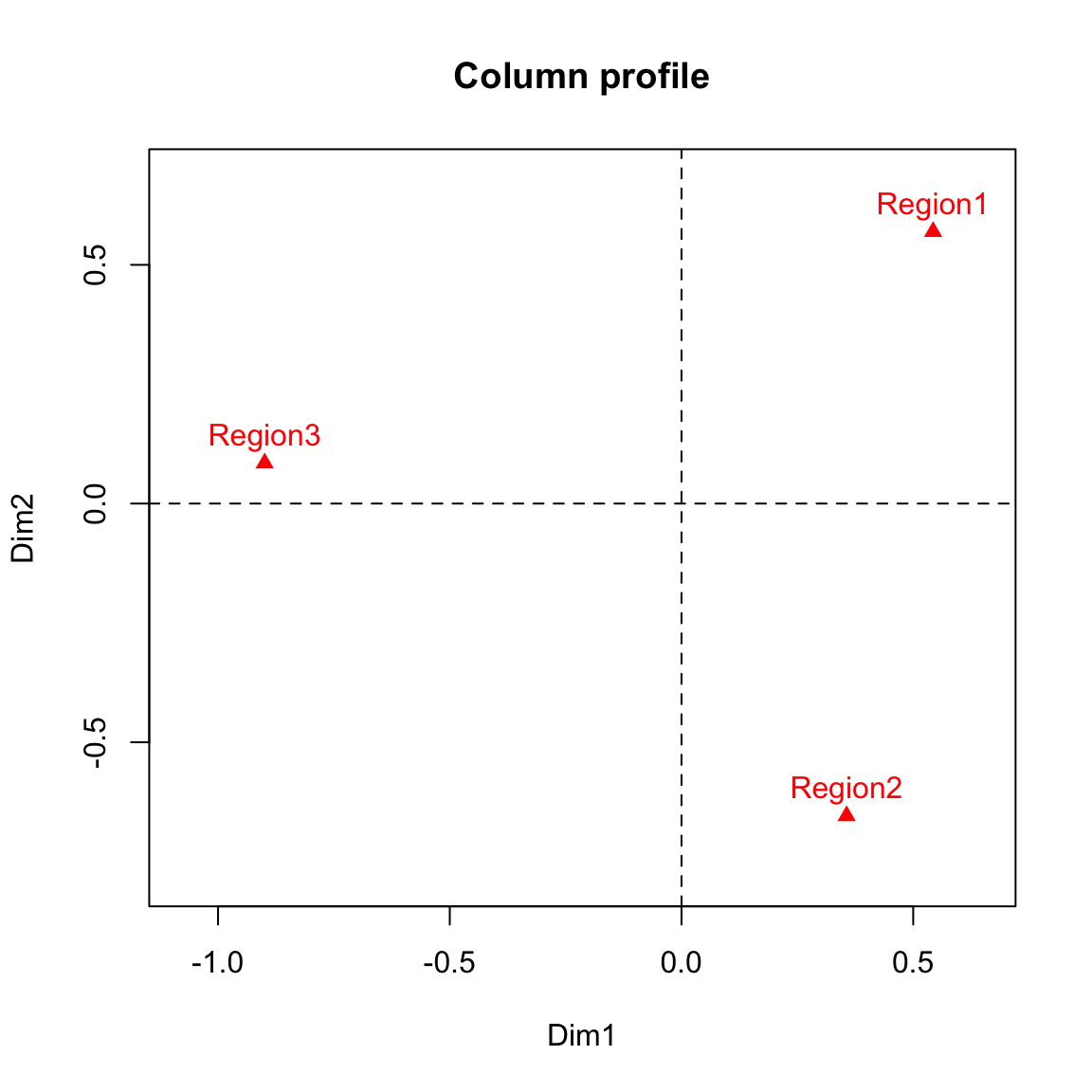
Compare these results to the ones in the lecture slides obtained directly using CA() function in R.
We can now make a biplot to represent both the row and column points. We will use red color for the column points and text and blue for the row points.
#Symmetric biplot of rows and columns to view the association
xlim <- range(c(row.coord[,1], col.coord[,1]))*1.2
ylim <- range(c(row.coord[,2], col.coord[,2]))*1.2

# Plot of rows
plot(row.coord, pch=19, col = "blue", xlim = xlim, ylim = ylim, main="Symmetric biplot")
text(row.coord, labels =rownames(row.coord), pos = 3, col ="blue")

# plot off columns
points(col.coord, pch=17, col = "red")
text(col.coord, labels =rownames(col.coord), pos = 3, col ="red")
abline(v=0, h=0, lty = 2)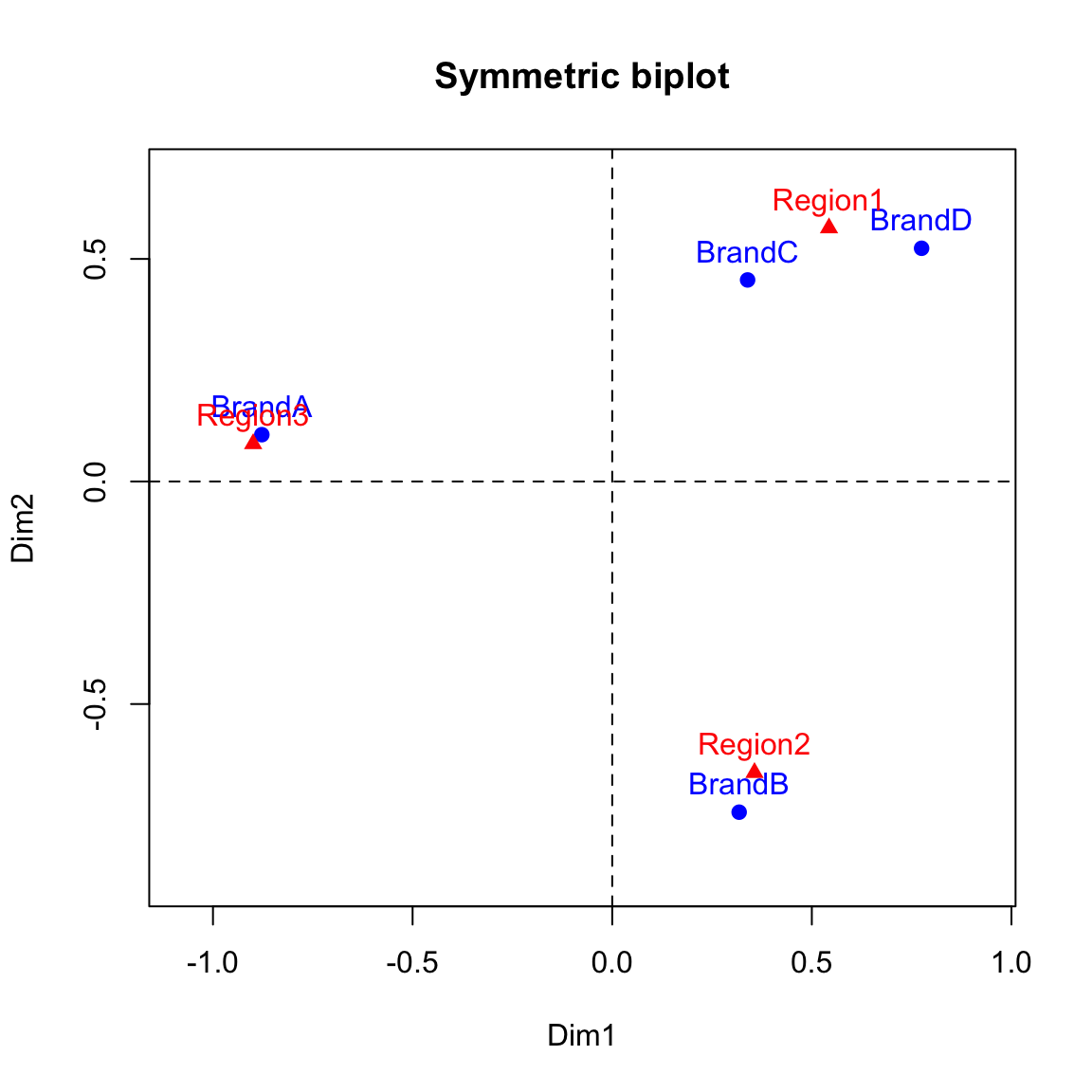
- The standard coordinates of rows given as \(X =D_{r}^{-1/2}U\).
X <- (pr%*%svd_res$u)[,1:2]
rownames(X) <- rownames(dat)
X- The standard coordinates of columns given \(Y =D_{c}^{-1/2}V\).
Y <- (pc%*%svd_res$v)[,1:2]
rownames(Y) <- colnames(dat)
Y
We mentioned in the lecture that asymmetric biplot is needed to interpret inter-distance between column and row profiles. For example, asymmetric row biplot is such that rows are plotted based on principal coordinates and columns are plotted based on standard coordinates. The code below plot asymmetric row biplot for the toothpaste usage data:
#Asymmetric biplot
xlim <- range(c(row.coord[,1], Y[,1]))*1.2
ylim <- range(c(row.coord[,2], Y[,2]))*1.2
# Plot of rows
plot(row.coord, pch=19, col = "blue", xlim = xlim, ylim = ylim, main="Asymmetric biplot")
text(row.coord, labels =rownames(row.coord), pos = 3, col ="blue")
# plot off columns
points(Y, pch=17, col = "red")
text(Y, labels =rownames(Y), pos = 3, col ="red")
abline(v=0, h=0, lty = 2)
# add arrows
for(i in 1:dim(row.coord)[1]){
arrows(x0=0, y0=0, x1=row.coord[i, 1], y1=row.coord[i, 2], col=4, length=0.1)
}
for(i in 1:dim(Y)[1]){
arrows(x0=0, y0=0, x1=Y[i, 1], y1=Y[i, 2], col=2, length=0.1)
}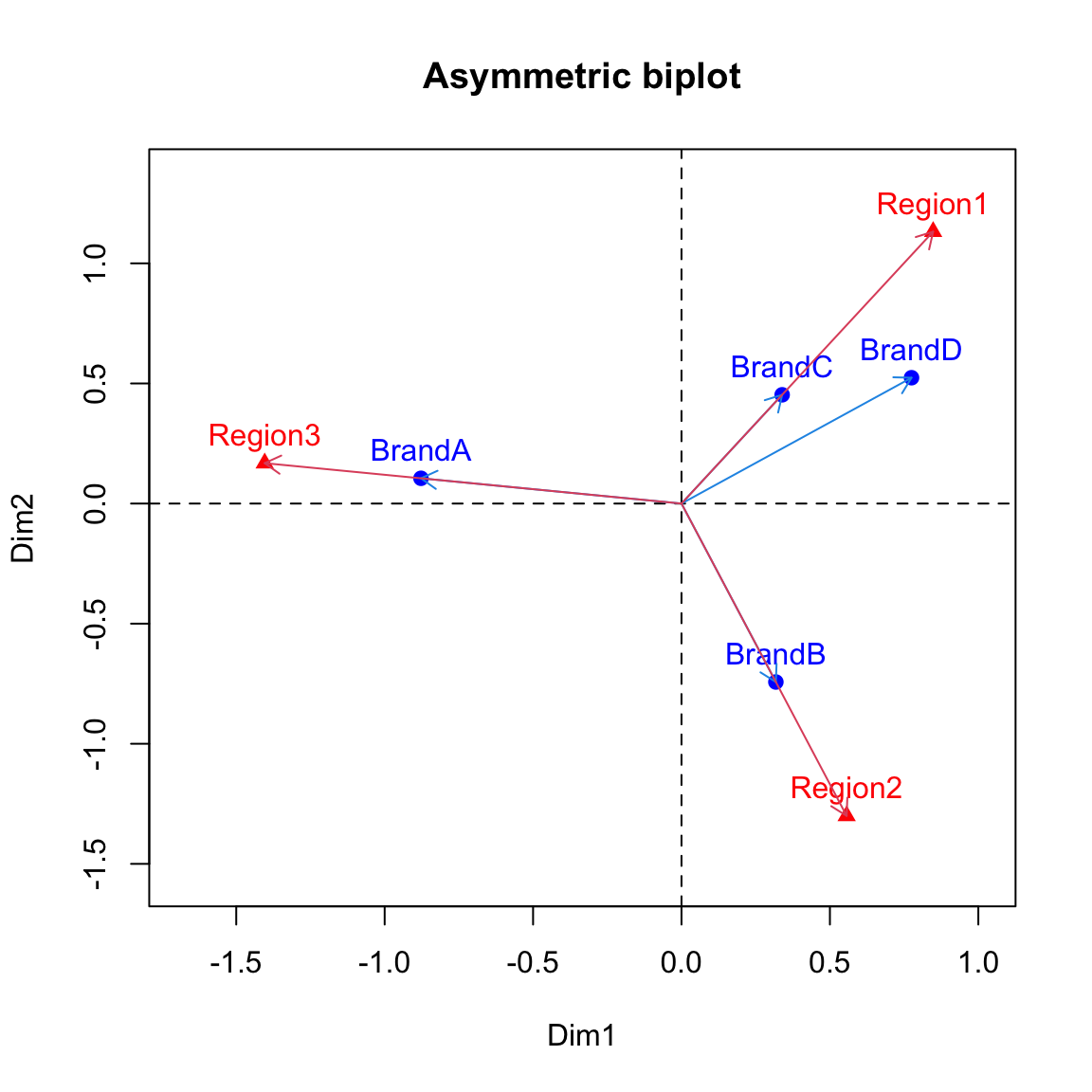 The interpretation of the plot is the same as what was given in the lecture slides (the strength of association is inversely proportional to the angle between the arrows).
- Contribution of rows to the dimensions can be calculated as \[contrib = row.mass * row.coord^2/eigenvalue\]
cc <- apply(row.coord^2, 2, "*", row.mass)
row.contrib <- t(apply(cc, 1, "/", eig))*100
row.contrib
## Dim1 Dim2
## BrandA 62.577844 1.455696
## BrandB 7.186641 63.600632
## BrandC 5.839534 16.872513
## BrandD 24.395732 18.072691
Now that we have seen how to work through simple correspondence analysis on a step-by-step basis. In the computer practical, we will see how to perform CA by using a ready made package in R. The two prominent packages are CA() [FactoMineR package] and ca() [ca package].